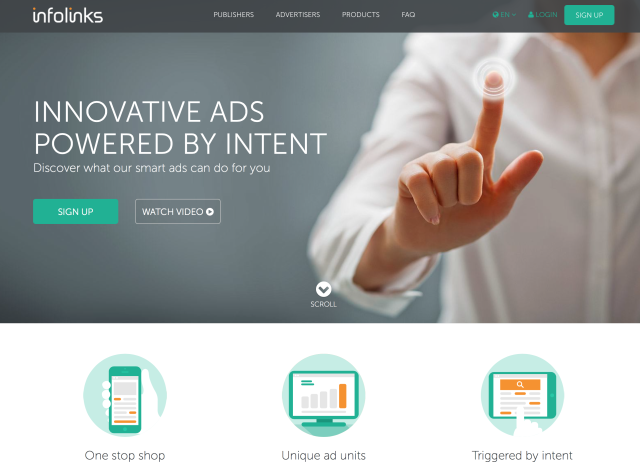
If you’ve noticed, Infolinks recently launched their new website today! It now looks more ergonomic, cleaner, and of course, better than the old one. However, the user dashboard when you login is still old. I think they will also be revamping the user dashboard (or the Publisher Center as they call it) soon to complement with the new site’s design and color scheme. And look! It’s mobile responsive (just visit their website at infolinks.com and resize your web browser to see).
Sadly, the publisher center is still not responsive, but let’s just wait and see for the upcoming UI updates from Infolinks. The old website doesn’t look that good compared to the new one. If you want to see the old layout, you can always check it out in the Wayback Machine (Just google or bing it if you have no idea about the Wayback Machine).
And oh, if you don’t have an idea what Infolinks is, you better sign up below:

Leave a Reply