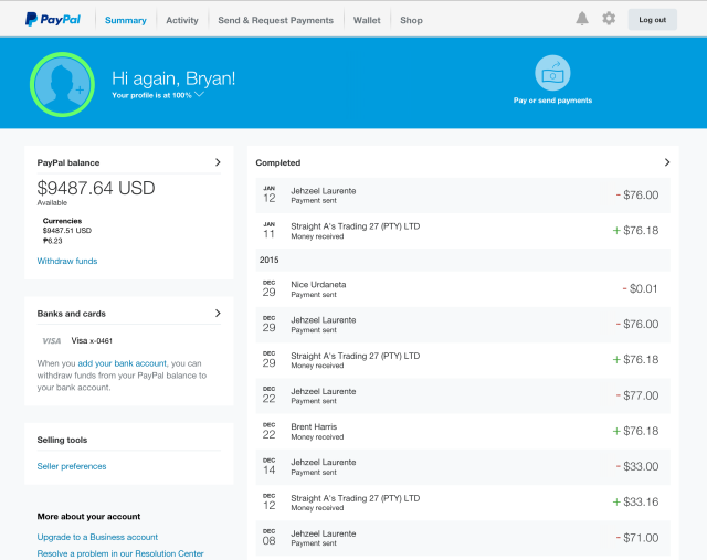
After logging in to Paypal today, I was surprised with the new dashboard design. It now looks modern, but slightly confusing as I’m using to the old design. It’s basically really neat and ergonomic. I somewhat remember the transition from Magento 1.9 to Magento 2.0 admin UI. Now, I just need to get used to it. I’m still not very familiar with the new user interface, as you know, it’s really new. Just today! I logged in yesterday, and I can clearly remember that they are still using the old UI yesterday. But now, it’s entirely new! Check it out in my screenshot below.

There’s a lot to like about the new design. One thing I like is that they put all your personal settings in one page. In the old version of the dashboard, you need to hover the profile link to see all the stuff that you can edit under your profile, like e-mail, bank account, credit card, and street address.
Now you just need to click on the “Gear” sign, which obviously represents your account settings. After clicking it, you’ll see all your personal details in one place. Now you can add and edit what you need to add and edit. I think there are more features in the new dashboard that I have yet to find out.
How about you? Do you love the new Paypal dashboard UI?

Leave a Reply