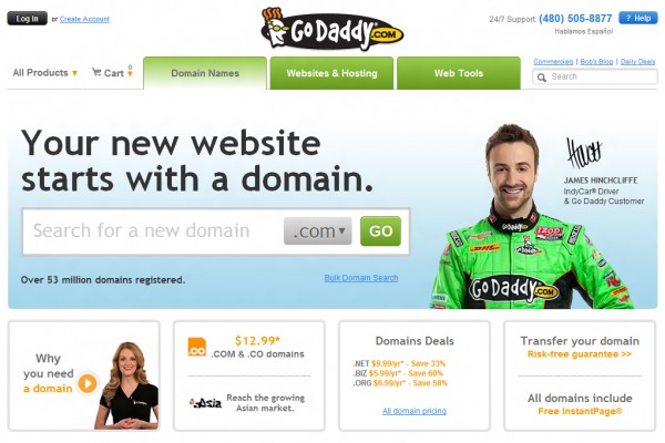
Just recently, as in very recently, to be precise, a 33 seconds ago, Godaddy has launch its brand new site design for its service marketing campaign. Nothing biggie here and it’s obviously a minor site revamp. Only the upper portion of Godaddy.com has been changed. Maybe there will be a major update in the next few days, but as of now, the new site design is quite great. It’s neat and it feels fresh, because it’s new. Haha!
Anyway, I just want to share Godaddy.com’s new website design. Nothing is really amazing here, all features and site functions are the same. I just loooove the new look and feel of their site.
Here’s the brand new Godaddy page that was launched a few seconds ago:

That’s all for now!

Leave a Reply